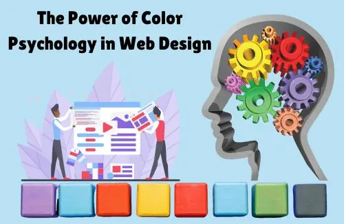
Colour psychology profoundly affects a viewer's perception and engagement in web design. Because digital impressions are created within seconds, this has further importance. Businesses in aggressively competitive markets like Chennai must utilise colour in brand marketing strategies to optimise their business identity. Let’s see how colours affect web design and how Aspira Technology applies colour psychology for website design.
Colour has a psychological impact through emotions, decisions made, and brand recollections. Choosing colour is a crucial decision in web design since a stunning 90% of first impressions are formed with colour alone. Studies also indicate 42% of users develop an opinion about a website within 0.05 seconds of looking at it. Using the colour scheme wisely increases brand trust, boosts conversions, and makes the experience more enjoyable at the same time.
Colours elicit different feelings. The following are some key colours that impact user perception:
Banks, technology companies, and healthcare professionals use this colour to show reliability and security. Trust can be established through blue, so brands like Facebook, PayPal, and LinkedIn utilise it. Ideal for corporate websites, finance, technology, and SaaS businesses.
This is the strongest colour and is often associated with rage, excitement, and energy. Red tends to be used in e-commerce platforms, promotional offers, and even food businesses (like Coca-Cola and YouTube). It is best to add red colour at CTA buttons, entertainment websites, and during clearance sales.
This colour brings positive memories, happiness, and warmth. Companies like McDonald’s and Snapchat add yellow to their logo to portray excitement and energetic vibes. Best Suited For: Creative agencies, food brands, and child-focused businesses.
Sustains health, nature, and well-being; green is widely used by eco-friendly businesses, health brands, and most finance companies. Brands like Whole Foods and Starbucks use green in their logos to promote relaxation and balance.
Best For: organic products, sustainability-oriented brands, and health & wellness.
This colour is linked to modernity, exclusivity, and refinement. Higher-end brands like Chanel and Apple tend to use black to represent luxury and high brand value.
Ideal For: High fashion brands, luxury and premium websites, and other high-value products.
Associated with friendly enthusiasm, orange is used by companies that wish to capture the attention of their audience. Amazon and Fanta use orange in their logos for adding excitement.
Best Suited For: CTA buttons, community-driven websites, and during promotions.
Enhance your text’s legibility using colour contrast. For example, using a light background with dark text is an example of good clarity.
For better visibility and action-oriented responses, CTAs should use high-contrast colours such as red, orange, and green.
Palette selection should fit with the specific message the brand is articulating while also leaning into industry norms.
Everyone means everyone, including the colour-blind. Using a colour-blind-friendly palette along with additional pointers such as icons for links or underlined text helps people with disabilities.
Anything from retargeting ads, landing pages, or company websites—at Aspira Technology a web design company in chennai, we know how to utilize colour psychology to develop pages that don’t only look amazing but are optimised for maximum conversion.
Colour selection and placement can dramatically change emotions and feelings towards your brand, which can lead to higher engagement and conversion rates. Here at Aspira Technology, we use colour psychology to amplify the stunning pages we design. We know the correct colour palette to use in every situation, allowing us to be one step ahead.
Want to put your products on display with a new website? Let’s get together to formulate a plan that maximises the potential of your brand alongside a catchy webpage.


